Happy World Communication Design Day

World Communication Design Day has been celebrated on April 27th since 1995. The International Council of Graphic Design Associations (ICOGRADA) designated the day to recognize the role of communication design and the graphic design profession around the world.

Though graphic design is often thought about in relation to advertising and marketing, the uses are extensive. The fields of administration, education, entertainment and many others use graphic design on various levels to convey information. Graphic design affects our understanding and opinions and shapes our actions and decisions. It determines the impact of information, whether it be through color, form or type; including the smallest street sign, the websites we browse, the products we purchase and the books we read.

World Communication Design Day

Graphic Design

Graphic Design is an interdisciplinary, problem-solving activity which combines visual sensitivity with skill and knowledge in areas of communications, technology and business. Graphic design practitioners specialize in the structuring and organizing of visual information to aid communication and orientation.

The Association of Registered Graphic Designers of Ontario

Graphic Design Process

The graphic design process is a problem-solving process, one that requires substantial creativity, innovation and technical expertise. An understanding of a client’s product or service and goals, their competitors and the target audience is translated into a visual solution created from the manipulation, combination and utilization of shape, color, imagery, typography and space.

Australian Graphic Design Association (AGDA), Profile/Purpose

World Communication Design Day is an important occasion for Affinity Express and our more than 1,500 employees. We salute our team for their hard work for clients and their commitment to delivering high quality work on time, day in and day out!

What does graphic design mean to you? If you submit pictures of online or offline designs that have affected you in some way, we’ll share the best entries in our next blog post.

Happy New Year 2013!

To our employees, clients, prospects and partners, wherever you reside in the world, we wish you success and joy in the new year and beyond!

New Year 2013-01

New Year’s Themed Ads Get Fired Up

With 2012 coming to a close, many of us look for ways to thanks our clients. It is an opportunity to stand out with special offers, interesting designs and strong messaging. As usual, our team also got quite a few design projects with a New Year’s Eve theme and we completed them fast and got positive reviews. Here are a few of our favorites from this season.

There is no doubt this is a New Year’s ad. The font is festive and it is complemented by fireworks, the single most used graphic element for this holiday. The result is an ad that gets viewers thinking about their plans for the big night!

Century 21 New Year's Ad

An ad for a New Year Eve’s party from the Ramada Palms is designed to make the party look exciting and fun with playful fonts. Champagne glasses are another traditional New Year’s graphic and the ad carries over the color of the champagne to the year, prices and the special offer.

New Year's Party AdAnother ad by Kim Roberts & Allen Title Company also incorporates fireworks in a simple design. It uses yet another festive font that you might see on a party invitation. The content of the ad stresses safety, which is a smart strategy for a company in the business of reassuring clients by providing title insurance and closing services for real estate transactions.

Kim Roberts & Allen Abstract & Title CompanyThis New Year ad by Peerless Products is beautiful and also ties in well to the company’s business: windows. This simple black and white design gets the point across that you can trust Peerless Products to keep you warm and safe in the winter but there is no sales language or any products listed. The magical letters appearing in the sky make it look like a page from an old storybook.

Peerless Products New Year's Ad

If you are working on an ad to tie in with the New Year’s holiday, you can’t go wrong by choosing a creative, script font, incorporating fireworks or champagne and using a black, white and gold color scheme. And be sure to keep it simple and uncluttered. This is a time of celebration and looking ahead to what we hope is a bright future.

Have you seen any great New Year’s ads yet? Do you remember any from previous years that resonated with you? What other graphics have you incorporated in your holiday ads?

Affinity Express wishes you all the best in 2013 and beyond!

Tips on Using Stock Photos

Images are a key component of every marketing design. When used properly, images can have an enormous impact, enticing viewers to stop and take in the message.

Finding the right images can be a challenging task because there are many options.

  1. You can take your own photos, but most of us are not professional photographers and amateur efforts never look as good. Plus, you might want something that you can’t easily photograph: a photo of an island in the ocean, for example, when you live 1,000 miles from the beach.
  2. Another option is commissioned photography, but the cost can be prohibitive for SMBs. It also requires a lot of time and effort: selecting locations, hiring models, etc.
  3. The third—and easiest—alternative is stock photography. One of the advantages is that you have millions of photos to choose from and it’s easy to purchase and download from websites.

One big downside of stock photography is that the images you choose might also be used by other subscribers to the service. But if you’re willing to risk not having a one-of-a-kind image, this is a cheap and easy option.

To use stock photos effectively, here are some things to consider.

Read more of this post

Your Marketing and Design Reading for The Weekend

Reading magazine outdoorsDo you find yourself at the end of each week with a virtual or literal pile of insightful articles and white papers to read? I’ll bet you were super excited to delve in when you first saw the links but, as the material piled up, you realized there is no possible way you can actually read everything? Well that is how my weekends typically begin.
With that in mind, we’re introducing a new feature that is a weekly compilation of the best industry articles we have read in the past week. Instead of wading through your ambitious collection, you can simply scan our highlights.

Enjoy the reading and please share with us any articles you think are on point or SMB marketing topics you want us to cover.

How to Breathe New Life Into Your Marketing With Visual Content

This was very timely because we are always trying to turn words into visuals to improve our online marketing. Recently, we spent extra time and attention on PowerPoint presentations. We are on the same page with Allyson Galle, who notes that “Most people don’t have any trouble coming up with ways to integrate visual content into their social strategy . . . But you should be thinking about the role visual content plays in all of your marketing channels.” That includes organic search, email marketing and more. The cliche is that a picture is worth 1,000 words but it is more true than ever today with our increasingly short attention spans! Thank goodness for Mel!

Read more of this post

The Romance of Wedding Ads

Since June is such a popular month for weddings, we thought it would be nice to review a few ads for this category. We get many requests to design ads for the range of wedding-related businesses but I didn’t realize how many until we requested some files to review for this blog post. As I looked through the dozens I got from our team, it was not a surprise to see that virtually all the ads are for jewelry, flowers, cakes, photographers, dresses, venues and planners.

As a rule, wedding ads are traditional. They featuring symbols like rings, flowers and cakes. Fonts are serif and often resemble invitation calligraphy.They have a single or main image rather than busy layouts. And if they are not romantic, they don’t sell.

The key thing to note about the ads is whether the style speaks to “the dream” that the bride, groom or other decision makers have for the big event. Let’s not kid ourselves, it’s the bride most of the time! An instantaneous connection has to be made. For example, if hot pink daisies are featured and you want a formal, evening wedding, you will turn the page or click over to another website.

Read more of this post

Optimize Your LinkedIn Company Page

Did you set up a company page on LinkedIn and then wonder what to do with it? Here’s a quick and easy guide to optimizing your company page.

If you’ve forgotten how to edit the page, you need to click on “Admin Tools” on the top right.

Overview Page

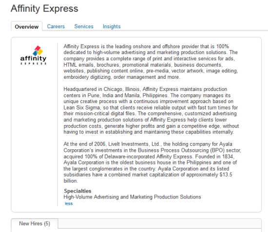
When you set up your page, upload your company logo as a 50×50 image. Fill in your company description. Don’t just copy-paste from your boilerplate. I did, and it looked like this . . .

LinkedIn Page: Company Overview (the boring version)

The result is big blocks of text that I doubt you’d want to read through. So I edited it and kept it brief and simple, but added our services in “Specialties.” Read more of this post

Apparel Ads Speak Volumes with Few Elements

We don’t work on apparel ads frequently as many other types like those for restaurants and the automotive category because they are often national campaigns developed and executed by advertising agencies. But every once in  a while, a local boutique will want to have a new ad designed and we are there to answer the call from our multimedia publishing clients!

An important thing to keep in mind about apparel ads is that they are all about image and appeal to specific segments of the audience, depending on the clientele. The photography has to be strong and the colors and fonts must reinforce the appropriate theme.

The ad below is directed toward a more affluent client because it touts a relationship between client and clothier, master tailoring and a personal shopper. You don’t go to this place to find a cheap t-shirt–you need an ample budget. That’s why the images are of what appear to be established businessmen in suits. The font is a classic serif and the gray and black colors couldn’t be more traditional. And if you had any doubt that this is a men’s store from its name and website address, the copy mentions it three more times in the heading, sub-head and body copy! Read more of this post

Designing Powerful Presentations

You can find quite a bit of advice about creating content for presentations, selling more effectively, asking qualifying/closing questions and more, but I wanted to share with you some perspective on the design of PowerPoint documents and give you a few ideas to make your presentations more visually compelling.

Research

Of course, you should learn everything you can about the person you are meeting with and his or her organization to ensure you include applicable content. But you should also visit the website to make sure you are using the current logo (some companies even publish their branding standards online).

Get a sense of the look and feel of the website: is it clean with a lot of white space, jammed with links and information, or mostly images and very few words? The website is a good guideline on how you should structure your presentation.

Something else to look for is any visuals you can adopt for your content. For example, if your prospect has a graphic outlining their quality assurance process, you can adapt the format and add your own points. Read more of this post

Designing Business Cards For Your Brand

With Mel Fernandez

“If you don’t get noticed, you don’t have anything. You just have to be noticed, but the art is in getting noticed naturally, without screaming or without tricks.”

–Leo Burnett

Despite the growing prevalence of smart phones and tablets, business cards are still important tools for sharing contact information and building relationships. You don’t have to use special apps or worry about compatibility, and they are cheap. They are also a branding opportunity to build credibility and share your company’s personality.

First and foremost, business cards have to provide the contact details that are appropriate for your industry, including at least two of these: an email address, phone number or website URL. The design should help you communicate this more effectively rather than distract or make information difficult to read.

Aside from the details, the starting point for designing a business card is the logo, as it will guide your choices for colors and fonts. Here are some other considerations: Read more of this post

Designs of the Quarter: Image Editing

The third category for the Designs of the Quarter contest was image editing. Our image editors work on pictures and make them more clear, or more complete, or remove backgrounds, or change colors, or make other modifications that the client wants.

This design won first prize, and you can see why. Something that starts as muddy-looking and shadowy becomes a clear image that conveys speed and power.

Image Editing: Gladiator

Read more of this post

Mother’s Day in Advertising

Because Mother’s Day occurs in spring, ads for this holiday often feature pastels and tend to be heavy on the pinks and purples. The fonts tend to look like script or fancy calligraphy and flowers are commonly used.

I didn’t know until I started doing some research, but Mother’s Day is one of the top sales opportunities for salons and spas–we all want to pamper mom because she takes care of everyone else the rest of the year. So it wasn’t surprising when I asked our team for ads designed for this holiday that this one turned up. It gets your attention with the bright, feminine colors and uses the same light blue in the logo to highlight the sale price effectively.

  Mother's Day Ad: Pedicure

Read more of this post

Designs of the Quarter: Videos

Video has emerged as such an important marketing vehicle it’s no surprise that our team is busy creating showcase, montage, pre-roll and post-roll videos and editing them for our clients. Our multi-media clients provide the service to their small- to medium-sized business clients. Typically, video would be too expensive for these advertisers. But the types of products we produce are affordable and take the SMB’s promotional efforts to a new level.

Here are our top picks from our video production work last quarter.

The first winning video ad uses a variety of effects to bring in all the different elements, separated by the curtains—a perfect device for a theater. The use of the fonts is appropriate to convey information that complements the moving elements.

Read more of this post

Designs of the Quarter: Print Ads

In our first Designs of the Quarter contest this year, we had a slightly different format. We awarded three designs in each of three categories, instead of three designs overall. The categories this time were: print ads, video and image editing.

Today, I’ll share the winning print ads with you.

This first ad is really striking in its layout and the use of fonts and colors. The ad design lives up to the slogan: “Makes other bourbons feel underdressed” by complementing elegant imagery with classic fonts and understated colors so the product is dominant. This bourbon suggests it is in a different class of spirits and the design reinforces that point!

Print Ad for bourbon

Read more of this post

Hair and Makeup Ads

What is different about hair and makeup ads is that you typically can’t get away with a lot of copy and clutter. A single photo often dominates and communicates the feeling of the company or product. When women buy beauty products, they buy a dream and photos have to convey these aspirations at a glance.

Color is also important to these ads because colors are the basis for good-looking hair and makeup. More than almost any other type of creative, the colors have to be right on.

In this ad, the goal is to draw in customers who want to freshen up their looks for spring. The photo has a lovely woman wearing makeup in cool tones of teal and pink. The designer picked up on this and used the same colors in the headline and again in the offer of a free makeover. The other important info–the location and phone number–is featured in a bright pink background.

Print Ad: Spring Color

Read more of this post

Differentiating with Direct Mail

How many emails did you receive in your business account last week? How many from outside your company did you actually read? For those that you didn’t read, how long did it take you to determine an email was a pitch, ad or other promotion?

Email is a relatively cheap marketing tactic so companies of all sizes can use it to target potential customers. And that’s pretty obvious by the volume of junk that comes our way—day and night!

If you are anything like me, you get hundreds of offers, updates and notifications a day and read somewhere between one and five percent of them. Even when I have “time” on the weekends or while standing in line using my phone, I’ve just run out of patience for the same old stuff in the same old way.

When I get snail mail, I’m also discriminating but actually open many of the envelopes. The reason is that I’m taking a break once per day to read my mail but am trying to work all while the emails roll in as interruptions.

We also use email at Affinity Express but have been leveraging direct mail more frequently in the past two years. It is more expensive in terms of production, materials and postage but it can be a tremendously effective if you use it selectively and follow these tips. Read more of this post

What We Mean When We Say We Design Ads

Isn’t it difficult to have your ads or marketing materials created by someone in a remote office?

Not really. The input we receive from customers varies from detailed instructions to a few scribbled lines of copy on a sheet. Our designers are pretty good at figuring out what works for the product and the brand.

The input for this ad has more direction than many and you can see the person has a solid idea of what he or she wants. We are comfortable following instructions and execute down to the letter for these customers. The more information they provide, the more we adhere and deliver exactly what they want.

Print ad for aging at home, with input

Read more of this post

Easter: Bunnies, Eggs and Crosses

Easter comes early this year and brings quite a few ads to our designers from companies eager to tie into the holiday and generate revenue. But not all ads at this time of year focus on business and festivities.

As with most holidays, there are traditional colors and images for Easter. Typically, we are asked to feature colorful eggs and the Easter Bunny. The desired colors are almost always pastels: pink, blue, purple, green, blue, yellow and orange.

A case in point is this ad for Pharmasave, complete with a bunny, eggs and pastel colors. What I find interesting is that the retailer is not promoting any products or prices but they are likely to get good traffic by offering free photos with the Easter Bunny. Kids for miles around will be lining up for a turn and the parents will probably pick up “a few things” while waiting. Pretty smart!

Ad for free photos with the Easter Bunny

Read more of this post

Selling Design Services to Your Customers

Wedding invitation designed by Affinity ExpressWe often work with clients who offer printing services to small businesses or to consumers for business cards, brochures, letterheads, posters, invitation cards and so on. But how can you capture more printing work per customer and increase your profits? Sell higher-value design services!

Identifying customers who are in need of design services is the first step to selling. How do you do this? In four simple ways.

What do you see?

Your biggest clue is the document that the customer wants printed or copied.

  • What is the condition of the customer’s original document? Is it well-designed or do you see obvious problems: stretched or blurred images, difficult-to-read text?
  • If the customer wants a copy of a printed document, is the original in good shape? Does it have markings on it or things taped onto it?
  • Did the customer provide only hand-written copy that they want you to type up and create a document for?
  • Does the customer own a business, but doesn’t have a logo?

Read more of this post

Happy Saint Patrick’s Day!

Because my first name is Kelly and I was born and raised in New York (where the first St. Patrick’s Day parade was held), I feel eminently qualified to review these holiday designs. So before you go out for a green beer (or many), take a look at these ads our team designed. It’s no surprise that many are for bars or clubs.

This one trots out all the standards for St. Patrick’s Day. You have the leprechaun, the beer, clovers and several shades of green. There are not one but two glasses of beer, in the event you didn’t already associate the beverage with the holiday. What works especially well is the bar’s logo–you can’t miss the red among all that green.

The one day everyone's a little Irish

This one has everything you want in an ad for the holiday. The theme is obvious, the information is easy to find and there are no extra elements. The large beer screams, “drink me!” As a result, the message is clear: come party and have fun with us at Hooligans.

Read more of this post